Comomango Mexican Kitchen and Cantina
Brand and Website Design
The founders of the Comomango restaurant approached me, after purchasing a building in their home town of
Madison, Connecticut, with the idea of opening a Mexican restaurant. Madison did not have this sort of establishment before Comomango so the founders felt it was a good opportunity. So, with the idea of a Mexican restaurant established, the founders and I got to work on creating and designing the Comomango brand.
To start the process of creating a new brand the founders first explained their vision to me. Based on what they said we then brainstormed words, phrases, and images that represented their vision for inspiration:
Inspiration Words and Phrases:
-
Authentic
-
Traditional
-
High end
-
Classy
-
Family friendly
-
Fusion (Mexican with a hint of American)
-
Eco-conscious

With these themes in mind the owners and I discussed what they wanted for a logo. They decided to keep it simple and just use the name of the restaurant as the logo: Comomango Mexican Kitchen and Cantina. Then, they explained that they wanted the lettering to have a western flare and that they wanted to explore green, a golden-yellow, and possibly pink for the color scheme. So I designed a few first draft iterations for them.
After they saw the iterations they explained that they liked the colors but they were thinking of something else for the typeface. So, one of the owners decided to draw out exactly what she was thinking. Then, I took the drawing, digitized it (outlined in Adobe Illustrator), corrected the proportions and straightened it out.
Once the owner saw the digitized version of her drawing she then asked that I try out different color schemes.
After seeing the new iteration of the logo and the different color schemes they decided to go with the golden yellow base and light green shadow. However, after some thought they gave me a new drawing to update the logo with. They felt that the lower case letters weren't bold enough so they asked me to try all upper case letters.
Final Logo:

Now that the logo was finalized we started working on the different restaurant assets, mainly the menu and the website.
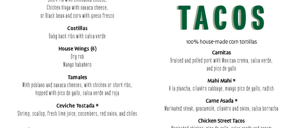
For the menu, the restaurant owners showed me some examples of menus they like and asked if I could create a menu inspired by them. These are the iterations.
Final Menu:


Once we finalized the menu I got to work on the website. Because this website is for a restaurant the owners wanted to use a specific platform that is already integrated with their POS system (Point of Sale system) called Toast. This particular platform has limited flexibility with design options so we kept the website simple to begin with.
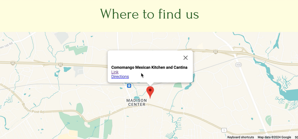
However, after a few months of the website being live and active the owners of the restaurant realized a more customized website would work better for them. So, the owners and I discussed what they would like and need on their website. The most important element I needed to keep in mind is connecting the new site to their POS system so they can still receive online orders seamlessly. After much discussion the owners decided to include these sections on the new website:
After seeing the new website I designed for them the owners decided to keep all content accept for the "About" page (they want to work on the writing themselves before publishing this section so it is yet to come). Additionally, they wanted me to add a short video of the front patio to the home page so people can see what the restaurant looks like immediately, along with a section for people to submit requests for parties or private events. Finally, they asked for me to make the color palette more "edgy". When I asked what "edgy" meant to them, they explained they wanted a darker website main theme color and lighter elements on top. So, I rearranged the color palette so that the website's main color is a dark, "foresty" green and all of the accents are some gradient of yellow or green. And so came the final, published restaurant website:


